

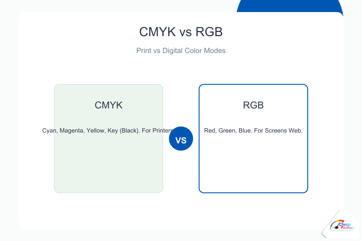
- Monitors use RGB light; commercial presses use CMYK ink (or spot colors).
- Design print files in CMYK when your software allows it.
- Approve a physical or hard-copy proof when brand color sells the offer.
Your brand blue looked perfect on the monitor, then shifted on the flyer. That is the classic CMYK vs RGB printing problem, not a mystery press error. This guide explains what is CMYK, how it differs from RGB color mode, why hex codes lie on paper, how neon colors break expectations, and what to do in Canva, Illustrator, and web-first workflows before you approve a run.
Should I design in CMYK or RGB for printing?
Design in CMYK when your tool supports it so you preview ink limits early. If your workflow is RGB-only (many web-first tools), export the best PDF you can and approve a printed proof for any job where color is part of the sale. RGB files can print well after professional conversion, but critical brand hues need verification on paper.
The core difference: screens vs printers
How RGB works
RGB color mode builds color with light. Red, green, and blue channels mix additively on screens. More light means brighter color. Monitors can show very saturated blues, neon greens, and hot magentas that have no exact ink equivalent.
How CMYK works
What is CMYK? Cyan, magenta, yellow, and black inks mix subtractively on paper. Each ink absorbs wavelengths. The printable range (gamut) is smaller than RGB. Commercial digital and offset presses use CMYK process builds for full-color photography unless you buy spot inks.
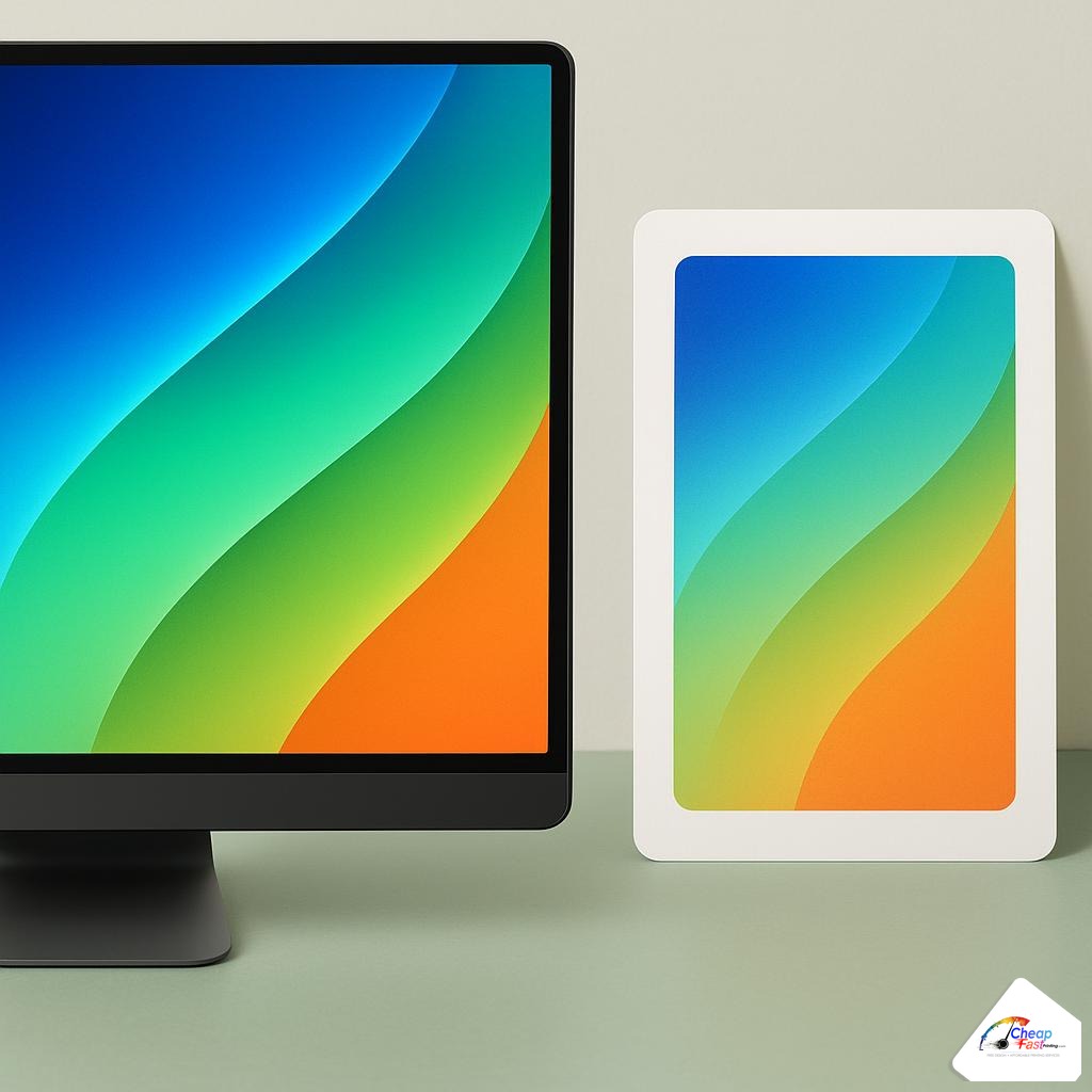
Color gamut: why your design looks different when printed
Color shift printing happens when RGB values outside the CMYK gamut are compressed into printable ink. The shift is largest in neon greens, electric blues, and intense oranges. Skin tones and neutral grays usually shift less if files were prepared with embedded profiles.
Coated vs uncoated paper
Coated stocks hold dots sharper and often look more saturated. Uncoated stocks absorb ink and soften brights. The same CMYK numbers can look different on two papers. Always judge color on the stock you will order.
Lighting in the print shop
Press floors use balanced lighting for approval. Office warm LEDs can make a proof look wrong when it is correct for production. Compare proofs under daylight or 5000K-equivalent viewing when possible.
Rich black, 100% K, and registration
Large black areas built from only 100% K can look gray next to photos. Designers use rich black (for example C40 M30 Y30 K100 on coated stock, recipes vary by shop) for deep backgrounds. Small body text should stay 100% K only to avoid registration fuzz.
Mis-set rich black in small type is a common prepress hold. Ask your printer for their preferred rich-black recipe for coated vs uncoated jobs.
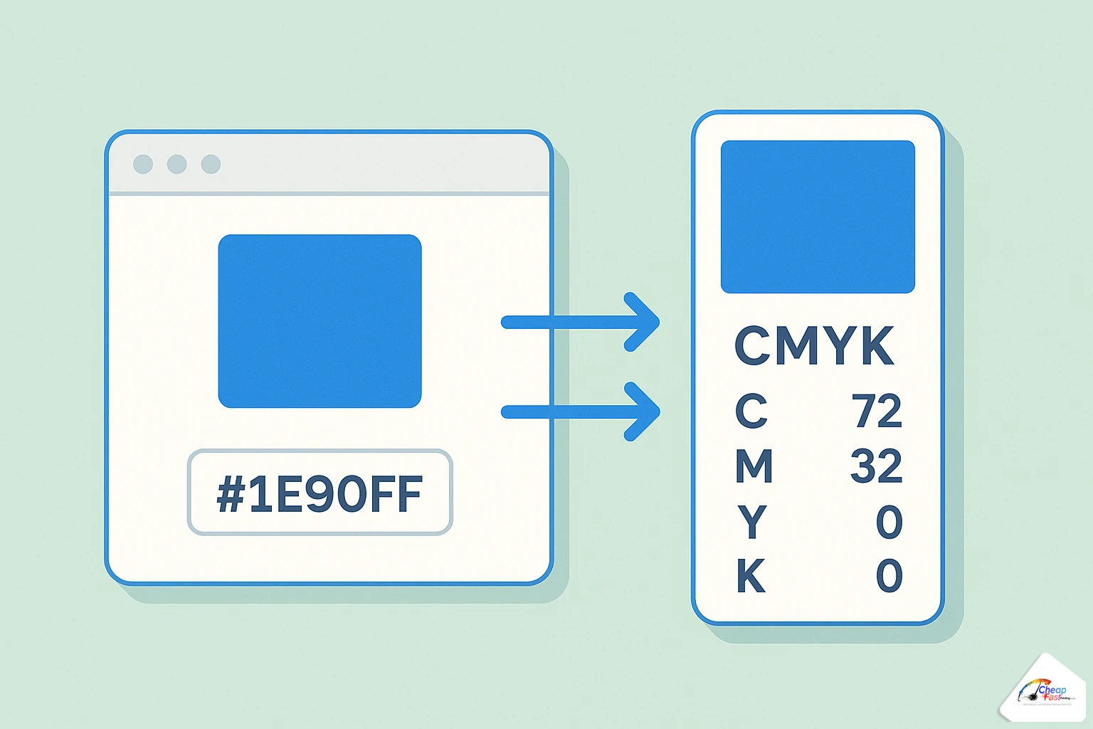
HTML hex codes vs print color profiles
Web developers work in hex (#2563eb). Browsers assume sRGB. Print uses CMYK color profile builds tied to paper and press. A hex swatch on screen is not a contract for ink on paper.
Pantone vs CMYK
Pantone (now part of color standards libraries) defines spot inks for brand match. CMYK mixes four process inks and drifts with dot gain. Brands with strict logos often specify Pantone for stationery and convert to CMYK for photo-heavy marketing pieces.
Why web developers struggle with print colors
CSS colors are luminous. Paper colors are reflective. Build a printed brand sheet with CMYK or Pantone targets, not only design tokens in Figma or Tailwind config.
When to use RGB vs CMYK
| Output | Mode | Notes |
|---|---|---|
| Websites, apps, social | RGB | Use sRGB assets |
| Business cards, flyers, brochures | CMYK | Embed profiles when exporting PDF |
| Both web and print campaign | Separate masters | Do not reuse one RGB file for everything |
| Brand-critical logo only | Spot or Pantone | May add cost; best match |
Real-world color scenarios
Scenario: franchise flyer with strict logo blue
A franchisee designs in Canva with an RGB brand blue. The first run shifts purple on coated stock. The fix: CMYK values from the brand book, a hard-copy proof, and a approved rich-black background recipe so the logo sits on a stable base.
Scenario: food photography menu
Tomatoes and greens carry more gamut than logos. Photos printed in CMYK look natural when shot and edited with print in mind. Over-saturated Instagram filters clip when converted.
Scenario: developer handoff from Figma
Export marketing PDFs separately from the app UI. UI uses RGB hex; print needs CMYK or proofed RGB with documented expectations. Do not assume CSS variables translate to ink.
How to convert RGB to CMYK (by tool)
Adobe Illustrator and Photoshop
Set document color mode to CMYK before placing logos. Convert linked images with Edit > Convert to Profile using your printer’s coated profile when provided. Check blacks on large areas vs small type.
InDesign
Package exports with embedded profiles. Preflight warns RGB images and pure-RGB swatches.
Canva and online designers
Many exports default to RGB PDF. They can print well after RIP conversion, but neon brand colors need proofs. Export PDF for print at highest quality; avoid tiny placed photos.
Figma and web exports
Export SVG or PDF logos to vector when possible. For raster, export at 2x or 3x only helps if the underlying frame is large enough; it does not fix RGB gamut limits on press.
Cost and value tiers for color-critical jobs
| Tier | Workflow | When it makes sense |
|---|---|---|
| Standard | RGB or CMYK upload, digital proof PDF | Promos, coupons, internal handouts |
| Brand-aware | CMYK master, specified rich black, coated stock | Service businesses with logos on solids |
| Color-critical | Hard-copy proof, possible Pantone spot | Retail packaging, franchise compliance |
Hard-copy proofs add time and cost but prevent reprints that dwarf proof fees. Online production stays economical when you treat the PDF proof as directional and the paper proof as final for hero colors.
Color workflow: proof tier investment
Share of total proof budget across workflow tiers (brand-critical jobs).
- PDF proof only25
- Hard-copy proof55
- Pantone / spot match100
Hard-copy and spot tiers cost more upfront but reduce expensive reruns on hero colors.
Neon and fluorescent expectations
True neon colors often require spot inks or specialty toners not available on every standard marketing print. If your brand relies on safety orange or electric green, plan for shift or budget for upgraded color capabilities and always proof.
Skin tones and portraits
Faces show conversion problems first. Soft-proof in CMYK and avoid extreme orange filters before export. Slight magenta reduction in shadows is a common press tweak, but starting from a reasonable CMYK photo prevents rework.
When color is critical, request a sample package on the same coated or uncoated stock you will order so you judge ink on paper, not only on screen.
Upload artwork for a preflight color check before you approve production.
Frequently asked questions
Can I print RGB files?
Yes. Many RGB PDFs convert at the RIP stage and print successfully. For brand-critical color, request a hard-copy proof because conversion is not reversible once ink is on paper.
What is Pantone vs CMYK?
Pantone specifies spot inks for exact brand matches. CMYK mixes four process inks for full-color photography and is standard on most marketing prints.
Why do my blues print purple?
Monitor blues are often out-of-gamut. CMYK builds use more magenta and black to approximate hue. Adjust art in CMYK mode or approve a proof and tune with your prepress team.
Does CMYK conversion in Canva ruin my design?
Conversion changes neon and very bright colors. Simple layouts usually survive well. Complex brand palettes should be proofed on the ordered stock.
Should logos be CMYK or spot?
Process CMYK is fine for most cards and flyers. Spot Pantone is worth it when franchise rules require exact logo match on solids.
Do I need a calibrated monitor?
Helpful for designers, not mandatory for buyers. A printed proof on the production stock is the authoritative check for small businesses.
Why do photos look flat after conversion?
Some RGB contrast does not translate 1:1. Light retouching in CMYK or soft proofing before export preserves skin tones and skies better than automatic one-click convert.
Is dark mode on my phone related to print color?
No, but editing photos on vivid phone screens misleads you. Judge marketing color on a printed sample, not a pocket display.