

- One flyer, one goal: pick a single call to action before you open any design tool.
- Match size to distribution (4×6 handouts, 5×7 promos, 8.5×11 detail), then apply the 60-30-10 color rule and a clear headline/body font pair.
- Export at 300 DPI with bleed, or upload rough art and let complimentary prepress finish the file before you pay.
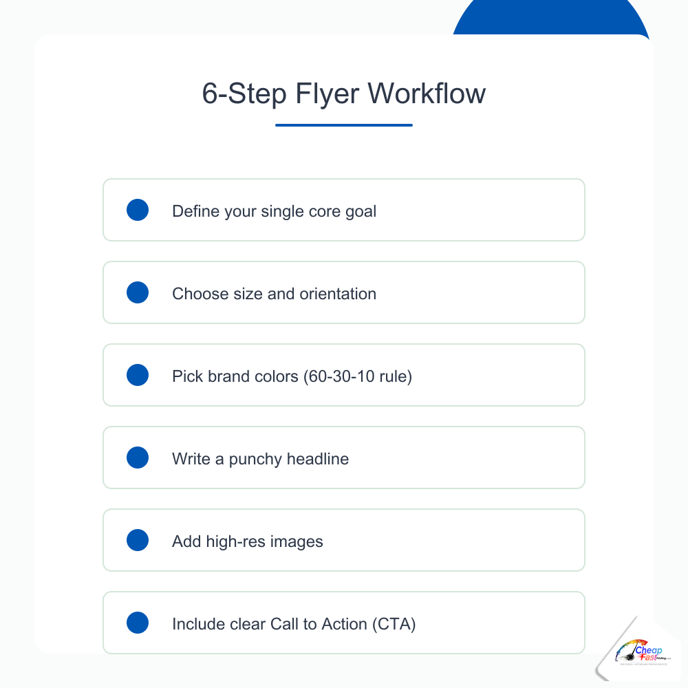
How to design a flyer without hiring a designer starts with structure, not software tricks. Most failed flyers try to announce everything at once: menu, hours, social handles, three offers, and a map on one sheet. Effective flyer design tips reverse that order. You define the outcome first, choose dimensions that fit how the paper travels, then build hierarchy so a stranger understands the offer in under three seconds. This guide walks through seven practical steps aligned with real prepress checks: goal, size, color and type, copy, images, logo and contact block, and export for print. You will also see common flyer layout best practices, a phase-effort chart, mistake warnings, and light notes on when uploading beats DIY. Pair it with our flyer sizes guide, free flyer templates, DPI explained guide, and print-ready file checklist when you move from layout to production.
- Design a flyer in 40 words
- Why step order matters
- Step 1: Define your goal
- Step 2: Choose size and orientation
- Step 3: Pick colors and fonts
- Step 4: Write headline and copy
- Step 5: Place images and graphics
- Step 6: Logo and contact info
- Step 7: Export for print
- Effort by design phase
- DIY vs template vs design help
- Industry scenarios
- When to skip DIY
- Inspiration resources
- FAQ (8 questions)
How do you design a flyer with no design skills?
Design a flyer from scratch by working in seven phases: define one goal and call to action, pick trim size and orientation for your distribution channel, set a simple color palette and two-font system, write a short headline plus supporting bullets, place photos at print resolution, add logo and contact details in predictable zones, then export a PDF with bleed and embedded fonts. Non-designers succeed when they treat the flyer like a sign, not a brochure. One message, one action, one visual path from headline to phone number or QR code.
Why flyer layout best practices follow a fixed step order
Random tool-hopping produces busy art. Canva tempts you with decorative fonts before you know whether the piece is 4×6 or 8.5×11. Stock photo sites invite full-bleed collages before the offer is written. Professional designers work goal-to-export for a reason: early decisions constrain later ones so you do not resize type three times or crop off a QR code at the cutter.
Eye catching flyer design is mostly subtraction. You remove secondary URLs, shrink the footer, and push whitespace around the headline until the offer reads from six feet on a bulletin board. The steps below mirror what our prepress team checks when a customer uploads a DIY file: message clarity, trim match, color contrast, readable type, image resolution, logo placement, and export settings.
Step 1: Define your flyer’s single goal
Before color or photos, answer one sentence: “After someone reads this for five seconds, what should they do?” That answer is your brief. Every layout choice should reinforce it.
One flyer, one message: why focus wins
Flyers fail when they behave like mini websites. A grand opening can mention catering, hiring, and loyalty app signup, but the printed piece should sell one primary action: “Visit Saturday for 20% off.” Secondary details belong in smaller type or on the back if you print duplex. Flyer design mistakes cluster around split attention: two phone numbers of equal size, competing red badges, or a headline that describes the business instead of the offer.
Write the goal at the top of your notes doc: fill seats, book consultations, drive QR menu scans, or collect email signups at a booth. If you cannot pick one, print two versions for two channels rather than one cluttered sheet.
Identifying your call to action before you design anything
Your call to action flyer element should be verb-first and measurable: “Book online,” “Show this flyer,” “Scan for menu,” “RSVP by Friday.” Placeholder CTAs like “Learn more” underperform because they do not tell the reader what happens next. Match urgency to the promotion: limited dates for events, clear hours for restaurants, and a single URL or QR destination tested on your phone before layout begins.
If the CTA is a QR code, decide the landing page first. Broken links discovered after 2,000 copies ship are expensive. Test on both iOS and Android cameras from arm’s length.
Step 2: Choose the right size and orientation
Size is a design constraint, not an afterthought. It controls line length, photo crop, and whether your headline can stay large enough for sidewalk readability.
Portrait vs landscape: when each works
Portrait orientation suits rack cards, door hangers, bulletin inserts, and handouts people hold vertically. Landscape orientation works for wide hero photos (venue interiors, vehicle wraps shown small) and some window postings. Default to portrait unless your hero image is inherently wide and your copy is minimal. Most flyer layout best practices for local services assume portrait because phones, doors, and racks are vertical.
Matching size to distribution channel
Choose trim before opening a template. Hand-to-hand street teams and bag stuffers often use 4×6. Salons, agents, and invite-style promos commonly use 5×7. Menus, job posts, and training sheets need 8.5×11. Specialty formats (rack cards, door hangers) require templates with die-cut safe zones. Our flyer sizes guide maps dimensions to postage, display hardware, and cost tiers so you do not design letter-size art for a pocket format.
Starting from a free flyer template at the correct trim prevents the classic shrink-to-fit error where 8.5×11 type becomes unreadable on 4×6.
Step 3: Pick your colors and fonts
Color and typography carry mood before words register. Restrain the palette and limit fonts so the offer stays legible on matte and gloss stocks under fluorescent light.
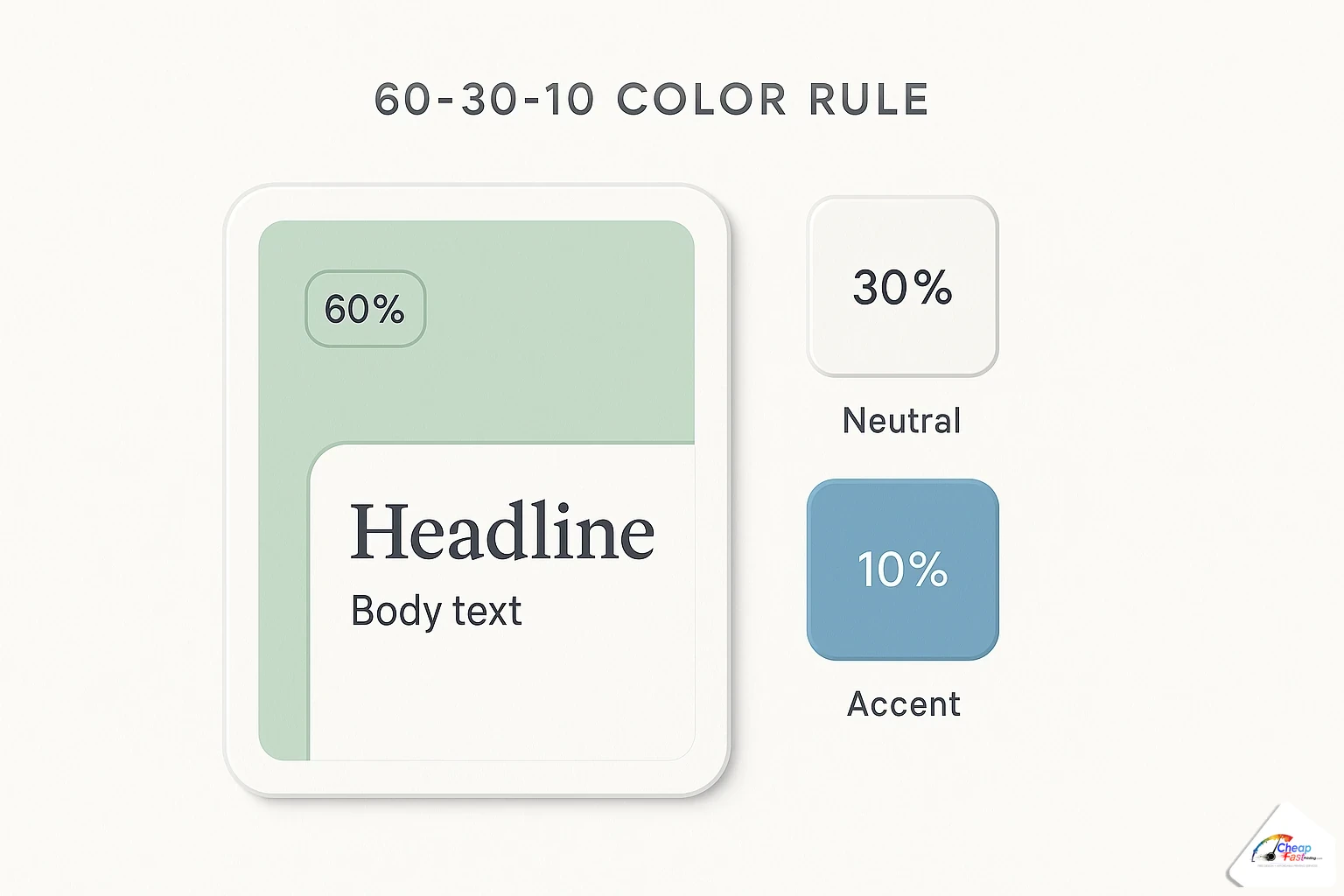
The 60-30-10 color rule for flyers
The color scheme for flyers often follows a 60-30-10 split: roughly 60% dominant background or neutral field, 30% secondary brand color for bands and accents, 10% accent for buttons, prices, or dates. Dominant neutrals (white, soft gray, deep navy) keep photos readable. Secondary colors frame the hero image or header bar. Accent color appears once on the CTA or price so it pops without rainbow noise.
Print differs from screen: saturated RGB blues and neon greens shift when converted to CMYK. Build with brand CMYK values when you have them. If you only have hex codes from a website, expect modest shift and approve a proof on paper before a large run.
Font pairing: headline vs body text
Flyer font choice should stay at two families: one display or bold sans-serif for the headline, one simple sans or serif for body and contact lines. Headlines need weight and width at a glance; body type needs comfortable x-height at 9-11 pt equivalent on print. Avoid pairing two decorative faces that fight for attention.
Fonts to avoid and why
Script fonts for headlines fail on low-resolution exports and small trims. Ultra-thin weights disappear on uncoated stock. Comic and novelty faces signal amateur unless your brand already owns that voice. All-caps paragraphs reduce reading speed. If a font is hard to read in a thumbnail, it will fail on a pole-taped flyer in rain.
Free font resources that work in print
Google Fonts, Adobe Fonts (with account), and system sans-serifs like Arial, Helvetica, and Source Sans cover most small-business jobs. When using free resources, check licensing for commercial print. Embed or outline fonts on export so type does not substitute at the RIP. Canva users should stick to built-in pairs marked for print documents rather than downloading random display faces.
Step 4: Write your headline and copy
Words do more work than decoration. Write copy in a doc first, then paste into the layout so you edit for clarity instead of fitting boxes.
Flyer headline formulas that get attention
Headline writing for flyers works with short patterns: benefit + timeframe (“Free estimate this week”), event + date (“Live music Friday 8 PM”), problem + relief (“Clogged drain? Same-day service”), or number + offer (“$99 cleaning for new clients”). Lead with the outcome the reader cares about, not your company history. Subheads support with one proof point: years in business, neighborhoods served, or a single testimonial line.
How much text is too much on a flyer
If you need more than six short bullets on the front, step up in size or move detail to the back. Flyers are scanned, not studied. Cut adjectives, remove duplicate contact methods, and delete three paragraphs of mission statement unless the flyer is an informational 8.5×11 sheet designed for reading at a desk.
Using bullet points and white space effectively
Bullets beat paragraphs for services, class schedules, and menu highlights. One line per bullet, parallel grammar, icons optional but not required. Whitespace around the headline increases perceived quality. Crowded flyers signal desperation; airy layouts signal confidence. Leave margin inside the safe zone so prepress does not move type inward and break your alignment.
Step 5: Place your images and graphics
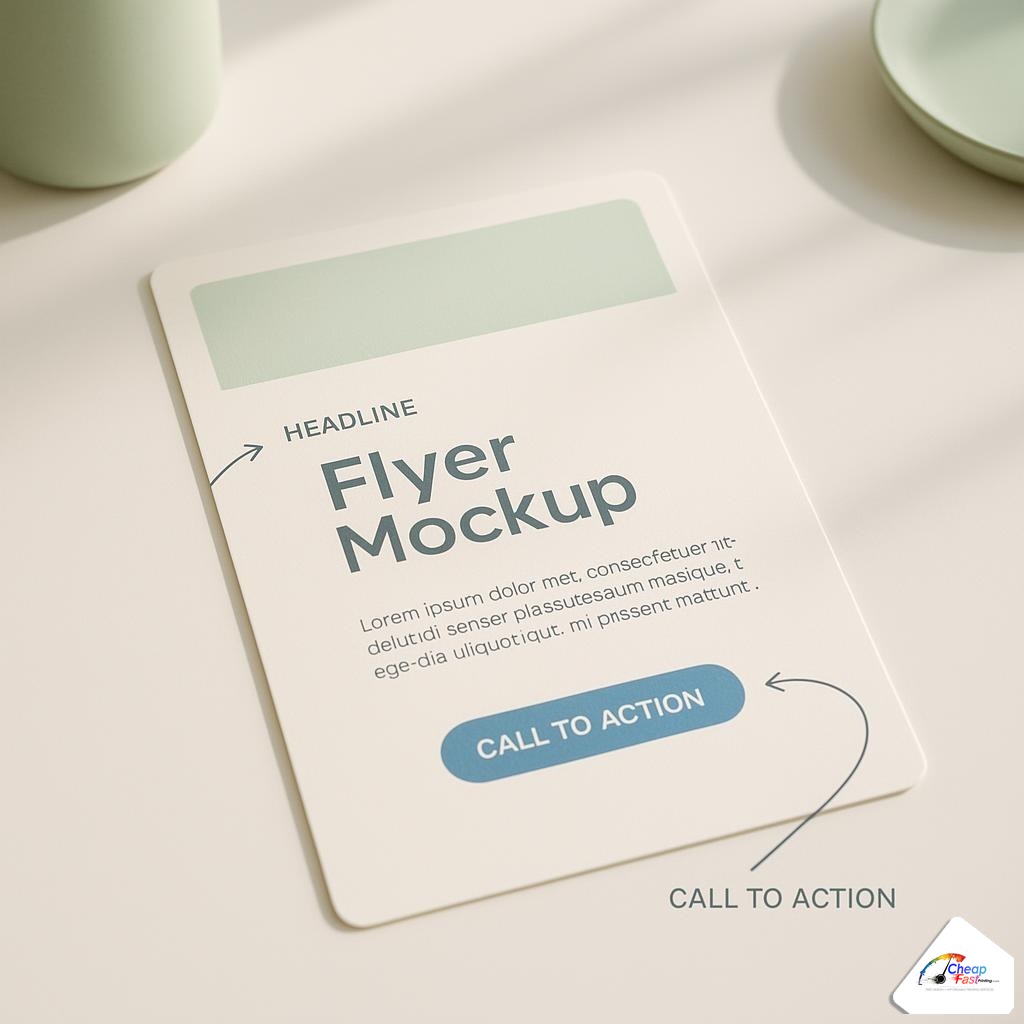
Photos prove the offer is real. One strong image beats four mediocre ones. Place imagery to support the headline, not compete with it.
Free stock photo sources for flyer images
Use licensed stock from Unsplash, Pexels, Pixabay, or paid libraries when you lack original photography. Choose images with simple backgrounds so text overlays remain readable. For food and beauty, original phone photos often outperform generic stock if resolution is sufficient. Avoid watermarked previews or competitor signage visible in the frame.
Image size and resolution for print (300 DPI rule)
Raster photos must meet roughly 300 DPI at final print size. A 4-inch-wide hero image needs about 1200 pixels wide. Pulling a website logo or Instagram thumbnail into a 5×7 full-width photo slot produces blur. Our DPI explained guide walks through pixel math and when lower resolution is acceptable on large banners viewed from distance.
Extend backgrounds into bleed when photos touch the trim edge. Soft gradients and skies are common failure points where white edges appear after cut if bleed is missing.
Step 6: Add your logo and contact info
Contact blocks should be findable without hunting. Repeat the primary action near logo and footer so the reader never scrolls mentally.
Where to place your logo on a flyer
Place the logo top-left or top-center for brand recognition, sized modestly so the headline remains largest. Bottom-footer logo lockups work for event sponsors. Keep clear space around the mark per your brand guide. Vector logos scale cleanly; raster logos need sufficient pixels at the displayed width.
Making your QR code part of the design
QR codes belong in the CTA zone with quiet space around modules. Minimum size depends on scan distance; arm’s-length handouts need roughly 0.75-1 inch square or larger. Add a short text label (“Scan to book”) so users know what to expect. Test print on desktop laser before committing to 5,000 copies. High-contrast black on white scans best; inverted QR on busy photos often fails.
Step 7: Export and prepare for print
Export settings turn a pretty screen layout into a press-ready PDF. This step separates DIY success from prepress rework.
Exporting from Canva for print
For a practical Canva flyer tutorial path: set custom dimensions to trim plus bleed (often 1/8 inch per side), design with safe margins, then use PDF Print or PDF Standard download with bleed and crop marks when available. Flatten effects if the printer requests it. Do not rely on PNG or JPEG alone for text-heavy work; PDF preserves vector type when fonts embed correctly.
RGB exports are common from online tools. They can print well after RIP conversion, but approve a proof for brand colors. Avoid transparent effects that rasterize poorly at line edges.
Checklist before submitting to the printer
Run through this list before upload:
- Document size matches ordered trim plus bleed
- Single clear CTA and tested QR or URL
- Photos at adequate resolution for their printed dimensions
- Fonts embedded or outlined
- Critical type inside safe zone; backgrounds extend to bleed
- CMYK or proof-approved RGB per your shop’s guidance
Our print-ready file guide expands each item for PDF/X workflows, Canva habits, and common preflight flags.
Where non-designers spend the most time
Copy and hierarchy decisions usually take longer than learning slider tools. The chart below indexes relative effort by phase so you budget time realistically before a deadline.
Flyer design: effort by phase
Where non-designers spend the most time when building a flyer from scratch (index).
|
1
Define goal |
2
Pick size |
3
Colors/fonts |
4
Write copy |
5
Place images |
6
Logo + QR |
7
Export |
Copy and hierarchy decisions often take longer than tool learning. Free design skips most phases.
DIY design vs templates vs complimentary layout help
None of these paths is morally better; they differ by time, skill, and risk tolerance.
| Approach | Best for | Time cost | Preflight risk |
|---|---|---|---|
| Scratch DIY in Canva or similar | Simple offers, tight budget, you enjoy tweaking | High first time, lower on reruns | Medium without bleed/DPI discipline |
| Start from print template | Standard sizes, industry layouts, fast events | Low to medium | Lower if template includes bleed guides |
| Upload notes + logo only | No time, messy brand assets, stakeholder approval chain | Low for you; production handles layout | Low when proof reviewed before pay |
Cost and value tiers for flyer design effort
| Tier | Typical approach | What you gain |
|---|---|---|
| Quick handout | 4×6 template, one photo, bold price | Speed and pocket-friendly distribution |
| Brand-aware promo | 5×7 custom layout, two-font system, CMYK logo | Consistent look for repeat monthly runs |
| Detail sheet | 8.5×11, multi-section bullets, proof on paper | Room for compliance text and schedules |
| High-stakes event | Template or upload plus hard-copy proof | Lower reprint risk for dated events |
Three scenarios: applying the seven steps
Scenario 1: Restaurant grand opening handout
Goal: drive opening-week visits. Size: 4×6 portrait for street team. Colors: 60% warm neutral background, 30% brand red band, 10% accent on “$5 appetizer” CTA. Headline: “Grand Opening March 12” with hours below. One food photo at 300 DPI width. Logo top, QR to menu bottom-right inside safe zone. Export PDF with bleed. Total design time: about 90 minutes for a first-timer using a restaurant template.
Scenario 2: Salon appointment special
Goal: book color services by Friday. Size: 5×7 portrait for counter display. Fonts: bold sans headline, light sans body. Copy: three bullets, no paragraph. Before/after photo cropped square. CTA: “Text BOOK to…” plus booking QR. Prepress often nudges script accents smaller for print legibility.
Scenario 3: Nonprofit community dinner
Goal: RSVP headcount. Size: 8.5×11 for lobby stand and bulletin insert. More text allowed, still one primary CTA. Sponsor logos in a footer band with equal height boxes. Export early enough for volunteer proofreading; typos in dates are the top reprint trigger we see on church flyers.
Skip the design work: when complimentary layout help makes sense
The seven steps teach how professional flyers are structured. They do not require you to execute every step alone. If you are hours from a deadline, lack brand files, or need stakeholder proof approval before payment, uploading a logo, photos, and bullet notes is a valid path. Complimentary prepress can rebuild layout, fix bleed and CMYK issues, and return a proof PDF before you commit to a large quantity. That is lighter-touch than hiring a freelance designer for every rerun, and it pairs naturally with proof-before-pay checkout when you want to see ink on paper before the full spend.
Flyer design inspiration resources
Use inspiration for structure, not copying. Browse local competitor handouts for sizing and CTA placement, Pinterest boards for typography pairs, and municipal event flyers for date hierarchy. Save screenshots annotated with what works: contrast, whitespace, single offer. Translate ideas into your palette and copy; do not lift photos or trademarks. When inspiration stalls, start from an industry template in our template library and swap content rather than staring at a blank canvas.
Tools for make a flyer online free tiers include Canva, Adobe Express, and similar browsers. Each can produce strong marketing art when you honor trim, bleed, and export settings above. Treat online tutorials as supplement to the seven steps here, not a substitute for size and resolution rules.
Send your logo, offer, and photos. Our complimentary design team builds a print-ready flyer and returns a proof before you pay.
Frequently asked questions
How do I design a flyer if I have no design experience?
Follow seven steps in order: one goal and call to action, correct trim size, simple color and two-font system, short headline and bullets, one strong photo at print resolution, logo and contact in standard zones, then PDF export with bleed. Templates and size guides reduce guesswork for first-time buyers.
What is the best size for a marketing flyer?
Match size to how people receive the paper. Use 4×6 for handouts and bag stuffers, 5×7 for balanced photo and copy, 8.5×11 when readers need detail like menus or schedules. Rack cards and door hangers use specialty dimensions with their own safe zones.
How many fonts should a flyer use?
Two font families are enough: a bold headline face and a readable body face. Avoid stacking script, novelty, and ultra-thin weights. Keep body type near 9-11 pt at print scale and test legibility by viewing the layout as a phone thumbnail.
What resolution do flyer photos need?
Target about 300 DPI at the photo’s final printed width. A 5-inch-wide hero image needs roughly 1500 pixels wide. Web and social images often fail when enlarged; see a DPI guide for pixel math and vector logo alternatives.
How do I write a flyer headline that works?
Lead with benefit, date, or offer in six to ten words. Patterns like “Event + date,” “Problem + solution,” or “Price + deadline” outperform vague titles. One primary call to action should sit near the headline or in a contrasting button band.
Can I design a flyer in Canva and send it to print?
Yes, when you set correct dimensions with bleed, use readable fonts, export PDF Print, and verify photos are sharp at final size. RGB exports are common; approve a proof for critical brand colors. A print-ready checklist covers embedding and margin flags before upload.
What are the most common flyer design mistakes?
Too many messages on one sheet, wrong trim for the channel, low-resolution logos, missing bleed on full-color backgrounds, untested QR codes, and tiny type on glossy stock. Fixing structure early costs less than reprinting after an event date passes.
Do I have to design the flyer myself?
No. You can start from a free template, upload a rough Canva export for prepress cleanup, or send copy and a logo for a complimentary layout rebuild tied to your print order. Review the proof PDF before approving production on pay-later workflows.