

- Flyer design tips that work in print start with one benefit headline, clear visual hierarchy, and generous white space—not more bullets.
- Use contrast, two fonts max, and one CTA so readers decide in under three seconds at arm’s length.
- Not a designer? The same principles apply when you upload rough art to our complimentary design service before you pay.
Flyer design tips separate promos that fill seats from paper that hits the recycling bin before the reader reaches the door. Most small-business flyers fail for predictable reasons: feature lists instead of benefits, weak hierarchy, muddy color, and calls to action buried under logos. This guide walks through seven practical flyer layout tips—headlines, eye flow, contrast, color psychology, typography, CTAs, and image quality—so your next handout reads clearly on the sidewalk and on press. For a full build-from-blank workflow, pair this with our how to design a flyer guide; for faster starts, browse free flyer templates sized for 4×6, 5×7, and 8.5×11.
What are the most important flyer design tips?
The most important flyer design tips are a benefit-led headline, visual hierarchy that guides the eye in three seconds, high contrast with real white space, intentional color and type, one unmistakable call to action, and print-resolution images only. Skip decorative clutter; every element should earn its place on a format readers glance at once. These marketing flyer best practices work whether you design in Canva or hand notes to a prepress team.
The psychology of attention: why most flyers fail
Flyers compete with phones, storefront glass, and conversation. Readers do not study them—they scan. Design for scan paths, not novel chapters.
The 3-second rule for marketing materials
In sidewalk tests we run during proof review, most people decide whether to keep a flyer within three seconds. That window covers headline, hero visual, and one action cue. If those three beats are unclear, body copy never gets read. The 3-second rule is why hierarchy in flyer layout matters more than font novelty: size and weight must telegraph what to read first, second, and last before anyone processes your fine print.
Failure modes repeat across industries. Restaurants list every entrée instead of tonight’s special. Salons paste four service menus when one appointment offer would convert. Contractors stack license numbers above the phone number. Each mistake steals seconds from the benefit. Strong flyers behave like billboards with a coupon attached—not like folded letters.
| Flyer mistake | What reader feels | Fix |
|---|---|---|
| Feature-first headline | “Not for me” | Rewrite as customer outcome |
| Low contrast type | Eye skips block | Dark on light or reverse with caution |
| Three+ fonts | Visual noise | One headline family, one body family |
| Hidden CTA | No next step | One button or phone line in safe zone |
| Soft web images | Cheap on glossy stock | 300 DPI at final trim size minimum |
Tip 1: lead with a benefit, not a feature
Features describe what you sell; benefits describe what the customer gains. On a flyer, the benefit belongs in the largest type on the sheet.
Headline examples: before and after rewrites
Before: “Family-owned HVAC since 1998.” After: “Stay cool this weekend—$49 tune-up, book by Friday.” Before: “Full-service salon.” After: “$20 off color appointments through Sunday.” Before: “Community food pantry.” After: “Free groceries Saturday 9–12—no ID required.” Notice how the after lines answer “what’s in it for me?” and imply urgency without shouting.
Subheads support the benefit with proof: neighborhood, date, or constraint. Keep subheads one line when possible. If your headline needs a paragraph to explain, the offer is not sharp enough yet. This is the same discipline we apply when customers upload bullet lists—designers extract one lead benefit and demote the rest to a short strip or QR landing page.
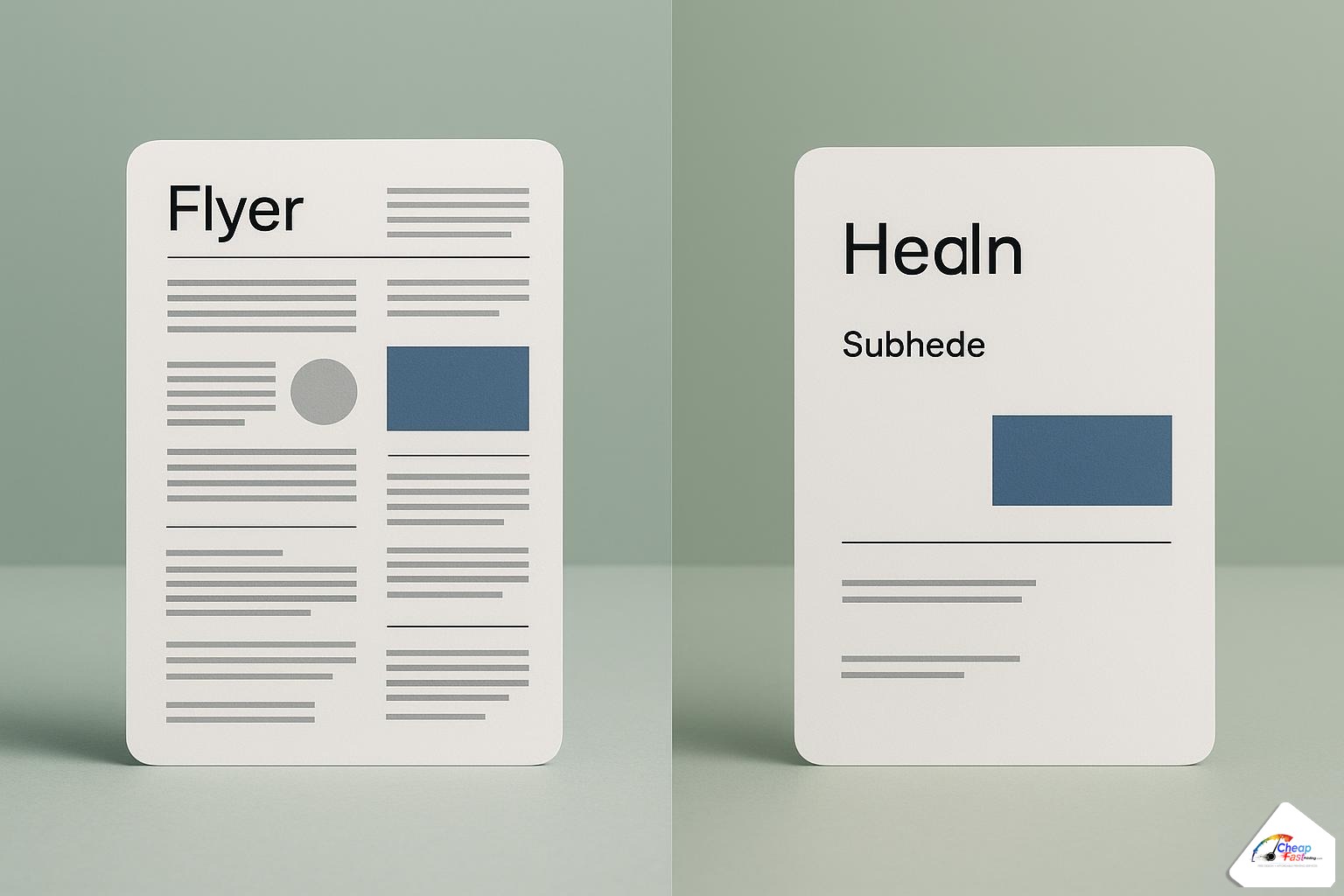
Tip 2: use visual hierarchy to guide the eye
Eye catching flyer design is controlled sequencing. Readers should hit headline, proof visual, offer block, then CTA in a predictable path—not a random collage.
Size, weight, color: the three hierarchy tools
Size is the loudest signal: headline at 2–3× body size for 5×7 and letter formats. Weight adds emphasis without shouting—bold for headline and CTA, regular for supporting copy. Color pulls focus when used sparingly: one accent hue for price, date, or button; neutrals everywhere else. Together they build hierarchy in flyer layout that survives quick glances and fluorescent lobby light.
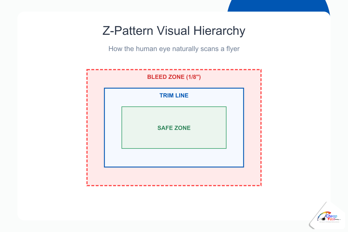
F-pattern and Z-pattern layouts explained
Western readers often scan text-heavy layouts in an F-pattern: across the top, down the left, with occasional horizontal jumps. Use F-patterns when you have a photo band, three bullets, and contact strip—common on 8.5×11 detail sheets. Z-pattern layouts suit image-forward promos: logo top-left, headline top-right or center, diagonal sweep through hero image to offer, CTA bottom-right. Event and restaurant handouts on 4×6 often follow Z-flow because there is little paragraph text to anchor an F.
Number focal points in your sketch before opening software: (1) headline, (2) hero, (3) offer, (4) CTA, (5) fine print. If you cannot rank them, the layout will fight itself on press.
Flyer layout: attention score by element
Relative visual pull of common flyer elements when hierarchy is done right (index).
| 100 | 82 | 74 | 68 | 22 |
| Headline | Hero image | Offer block | CTA button | Fine print |
Strong headlines and one clear CTA outperform cluttered multi-message layouts.
Tip 3: master contrast and white space
Contrast in print design is not only black on white. It is the separation between headline and background, between offer block and photo, between CTA and everything else. Weak contrast is the fastest way to lose sidewalk readers.
Why cluttered flyers lose readers instantly
Clutter signals “work required.” Busy grids, overlapping photos, and border-on-border frames make the brain defer the read. We see this on press when customers export social graphics at full bleed: every inch is loud, so nothing is important. Flyer design mistakes to avoid include stuffing QR codes, maps, logos, and three photos into one 4×6 safe zone—type shrinks, contrast collapses, and phone numbers clip at trim.
How to use negative space as a design element
White space design is active margin, not empty failure. Padding around the headline lets it breathe; padding around the CTA makes it clickable even on paper. Rule of thumb: leave at least 0.25 inch clear inside the safe zone on all sides of your primary CTA and phone line. On dark backgrounds, increase padding—dark ink spreads slightly on uncoated stock and can swallow tight type.
Group related items and separate unrelated ones with space, not lines. A thin rule above the contact strip is fine; boxing every bullet is not. When in doubt, delete one element and re-proof. The before/after pairs that perform best in our customer reruns are almost always subtractions, not additions.
Tip 4: color psychology for print marketing
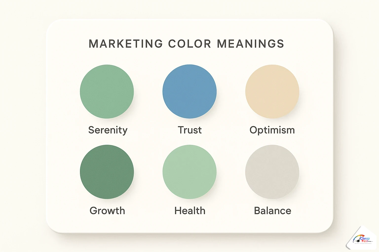
Color psychology marketing flyers lean on association, not magic. Color sets mood before words register—warm for appetite and energy, cool for trust and calm, high-chroma accents for price and deadlines.
What different colors communicate to buyers
Red and orange push urgency and appetite—useful for limited-time food deals and event dates, easy to overuse. Blue and teal signal reliability—common for clinics, finance, and contractors. Green suggests growth, health, and eco positioning—farmers’ markets, wellness, landscaping. Yellow draws attention in small doses; large yellow fields fatigue the eye in CMYK. Purple and deep plum read premium for beauty and boutique retail. Neutrals (charcoal, warm gray, off-white) should carry 60–70% of the sheet so accents stay meaningful.
Color combinations that work in CMYK print
Screen RGB neon does not always survive ink on paper. Favor solid CMYK builds over heavy transparency stacks that band on digital presses. Pair one dominant neutral, one secondary field (photo or color block), and one accent for CTA or price—the 60-30-10 rule scales well to flyers. Avoid red text on blue fields and thin yellow type on white; both fail contrast checks and reprint tests. When brand colors are non-negotiable, request a proof on your chosen stock—gloss shifts saturation versus matte.
Tip 5: choose fonts with intention
Typography for flyers should disappear into clarity. Readers notice type only when it blocks comprehension.
Serif vs sans-serif for different tones
Sans-serif families (Helvetica-style grotesks, geometric sans) dominate modern promos: clean at small sizes, strong in caps for headlines. Use sans for contractors, gyms, tech, and most retail handouts. Serif headlines suggest tradition and editorial weight—law, legacy restaurants, formal galas. Pair serif headlines with sans body for readability. Script and display faces work for accent words (a salon name, a wedding monogram) never for phone numbers or dates.
Never use more than two fonts on a flyer
One font family with multiple weights often beats two unrelated families. If you need contrast, pair a condensed bold headline with a regular body sans from different families that share similar x-height. Cap headline sizes between 24–48 pt on 5×7 depending on word count; body 9–11 pt for short bullets, never below 8 pt for older audiences. Track headlines slightly tight; add line spacing in bullets for scanability. Embed or outline fonts on export—missing font swaps are a top prepress hold.
Tip 6: make your call to action impossible to miss
Your flyer call to action is the physical button on paper. One CTA per flyer: call, book, scan, or visit—not all four with equal weight.
CTA placement, size, and wording
Place the CTA after the offer block on the natural eye path—bottom center or bottom right on Z-layouts, end of the left rail on F-layouts. Size it equal to or larger than subheads. Wording should be verb-first: “Book your color appointment,” “Scan for menu,” “Call for free estimate.” Include one contact method prominently; secondary methods can sit smaller beneath. Keep CTAs inside the safe zone so trimming never clips “Call now.”
Adding urgency without being pushy
Deadline honesty works: “Through Sunday,” “First 50 customers,” “Grand opening June 12.” Fake perpetual urgency erodes trust on local flyers people see on the same counter weekly. Pair urgency with a single proof point—star rating, years in business, neighborhood name—to balance pressure with credibility.
Tip 7: use high-quality images only
Photos sell faster than paragraphs when resolution and cropping cooperate. Soft images on glossy stock shout amateur louder than any typo.
Free image sources that look professional in print
Start with libraries that offer high-resolution downloads and clear licenses: Unsplash, Pexels, and Pixabay for royalty-free starters; paid stocks when you need specific demographics or product shots. Search for images sized at or above your final trim at 300 DPI—roughly 2100×1500 px for 7×5 inch portrait heroes. Avoid upscaling phone photos; grain prints visibly at 100 lb gloss.
Crop for the template aspect ratio before layout. Extend backgrounds into bleed on full-bleed photos so skies and floors do not white-line at the cutter. Convert RGB exports to CMYK-minded palettes—over-saturated reds and neon greens are common reprint fixes on our line. One strong hero beats three mediocre thumbnails every time.
Not a designer? Let us apply all of this for free
These flyer layout tips are the same checklist our prepress team uses when you upload rough art, a template export, or a bullet list in the order notes. Complimentary design covers hierarchy passes, contrast fixes, font substitution, CTA placement, image resolution checks, bleed extension, and CMYK conversion—human-reviewed, not auto-sent to press.
Free professional design with every order
Send what you have: a Canva PDF, a phone photo of your whiteboard, or fields copied from our template library. Designers return a proof PDF you approve before production on pay-later workflows. Revisions focus on print readiness—moving phone numbers inside safe zones, strengthening headlines, swapping low-res art—not unlimited brand reinvention. That scope matches most restaurant, salon, church, and contractor promos where speed and clarity beat bespoke illustration.
If you are still choosing dimensions or margin specs, the scratch-build companion article linked in the intro covers trim, bleed, and export steps end to end. Templates linked there give you correct safe zones so these design tips start on a structurally sound canvas.
Upload your flyer art or notes. We align hierarchy, contrast, and CTA placement with these principles and send a proof before you pay.
Frequently asked questions
What is the single best flyer design tip for beginners?
Lead with one clear customer benefit in the largest type on the sheet, then support it with one photo, three short bullets maximum, and a single call to action. Beginners improve fastest by deleting copy rather than adding decoration. If the offer is not obvious in three seconds at arm’s length, simplify before you tweak fonts or colors.
How many fonts should I use on a marketing flyer?
Use no more than two font families: one for headlines and CTAs, one for body and bullets. Many strong flyers use a single family in bold and regular weights only. Avoid script or display faces for phone numbers, dates, and URLs. Always embed or outline fonts in PDF exports so type does not swap at prepress.
What colors work best for flyer printing in CMYK?
Build around a neutral base (60–70% of the layout), a secondary color field or photo (30%), and one accent for price or CTA (10%). Test brand reds and greens on a printed proof—RGB-screen neons often shift on glossy stock. High contrast between type and background matters more than trendy palettes.
Where should I place the call to action on a flyer?
Place the primary CTA on the natural scan path—bottom center or bottom right on image-forward Z-layouts, or the end of the left column on text-heavy F-layouts. Size it at least as large as your subhead, verb-first, with one main contact method. Keep it inside the safe zone so trimming never clips digits or QR quiet zones.
How much white space should a flyer have?
Enough that the headline, offer, and CTA each have clear breathing room—typically at least 0.25 inch padding inside the safe zone around critical text. Cluttered full-bleed collages shrink type and kill contrast. When the layout feels busy, remove one photo or one bullet group before reducing font size.
What image resolution do I need for sharp flyer printing?
Target 300 DPI at the final printed size of the image area. For a 5×7 inch hero photo, that is roughly 2100×1500 pixels minimum at full bleed. Do not upscale small web thumbnails; grain shows on 100 lb gloss. Extend photo backgrounds into bleed so edges do not white-line at the cutter.
What is the difference between Z-pattern and F-pattern flyer layouts?
Z-pattern guides the eye diagonally—logo or corner entry, headline, hero image, offer, CTA—ideal for photo-led 4×6 and 5×7 promos. F-pattern suits text-heavy letter flyers: top headline bar, left-column scan, occasional horizontal jumps. Pick one pattern per design; mixing both without hierarchy creates visual noise.
Can your free design service fix my flyer layout?
Yes. Upload your PDF or source export and note your ordered trim size. Prepress strengthens hierarchy, contrast, CTA placement, resolution, bleed, and CMYK readiness, then sends a proof PDF for approval before production charges on pay-later orders. Scope covers print-ready layout fixes, not full brand strategy from zero.